Grand Prix for the Festival brand campaign
- Home
- Festival
- 2020-and-before
- Articles
- Grand Prix For The Festival Brand Campaign
June 19, 2014
The Bergen International Festival’s visual design, created by ANTI Bergen, has received a Grand Prix at the Cannes Lions International Festival of Creativity. It is the first time a Norwegian agency has won the design category in this prestigious competition.
There were 2624 entries in the design category, seven of them from Norwegian agencies. The prestigious award in Cannes tops the list of international prizes that the festival design has received. Anti Bergen’s branding campaign has previously received gold in the One Show in New York, two golds in ADC Global, gold and “Best in Show” during the European Design Awards, in addition to several Norwegian awards.
Anders Beyer started a thorough strategy process for the Bergen International Festival when he took over as Festival director in August 2012. Important ambitions were to renew, rejuvenate and engage, and design was one of the tools that would help the Festival to reach these goals.
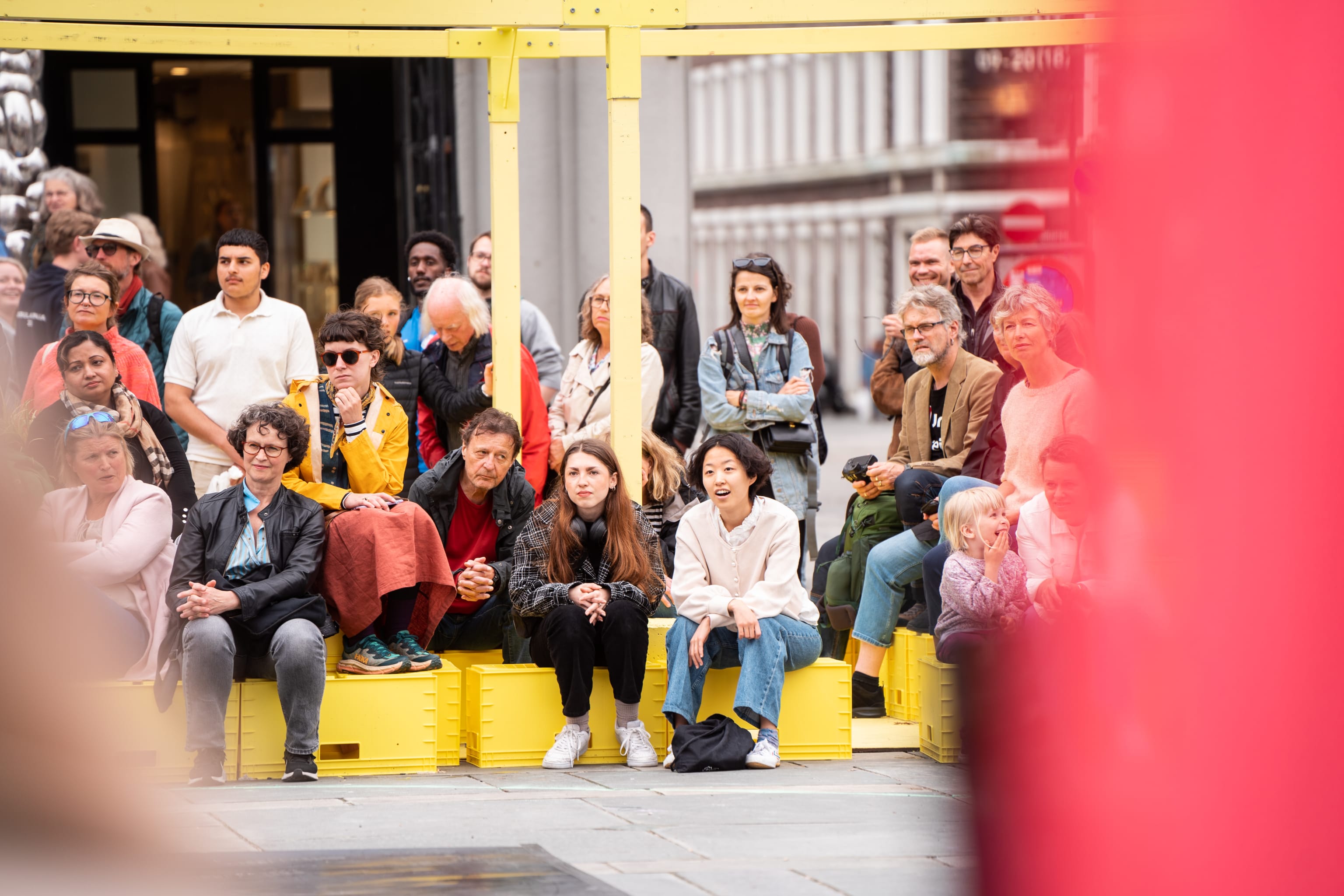
– An important goal for the Festival is to increase the audience’s engagement and reach new and younger people. We wanted to loosen our collar and put more emphasis on the playful. ANTI’s design is rigid and minimalistic, but invites you to play at the same time. Our collaboration has been incredibly inspiring, and we are very proud of all the national and international awards the design has received, says festival director Anders Beyer.This year’s festival has sold a record number of tickets, and has become an even more visible part of the cityscape. The new visual profile, which was launched last year, has been presented on cars, clothing, LEGO buildings and nail design – in addition to more traditional surfaces such as flags, banners, web pages, posters and programmes.
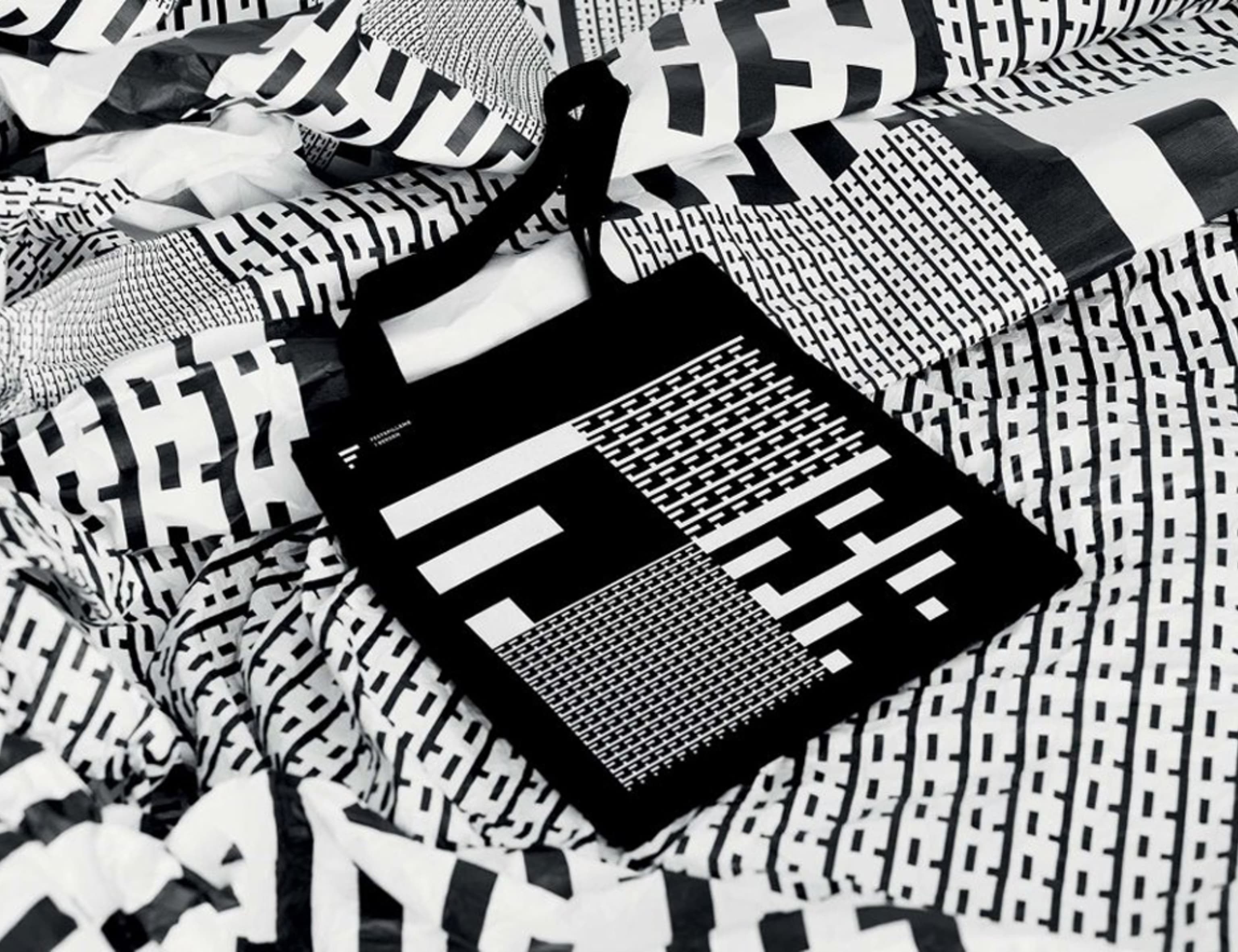
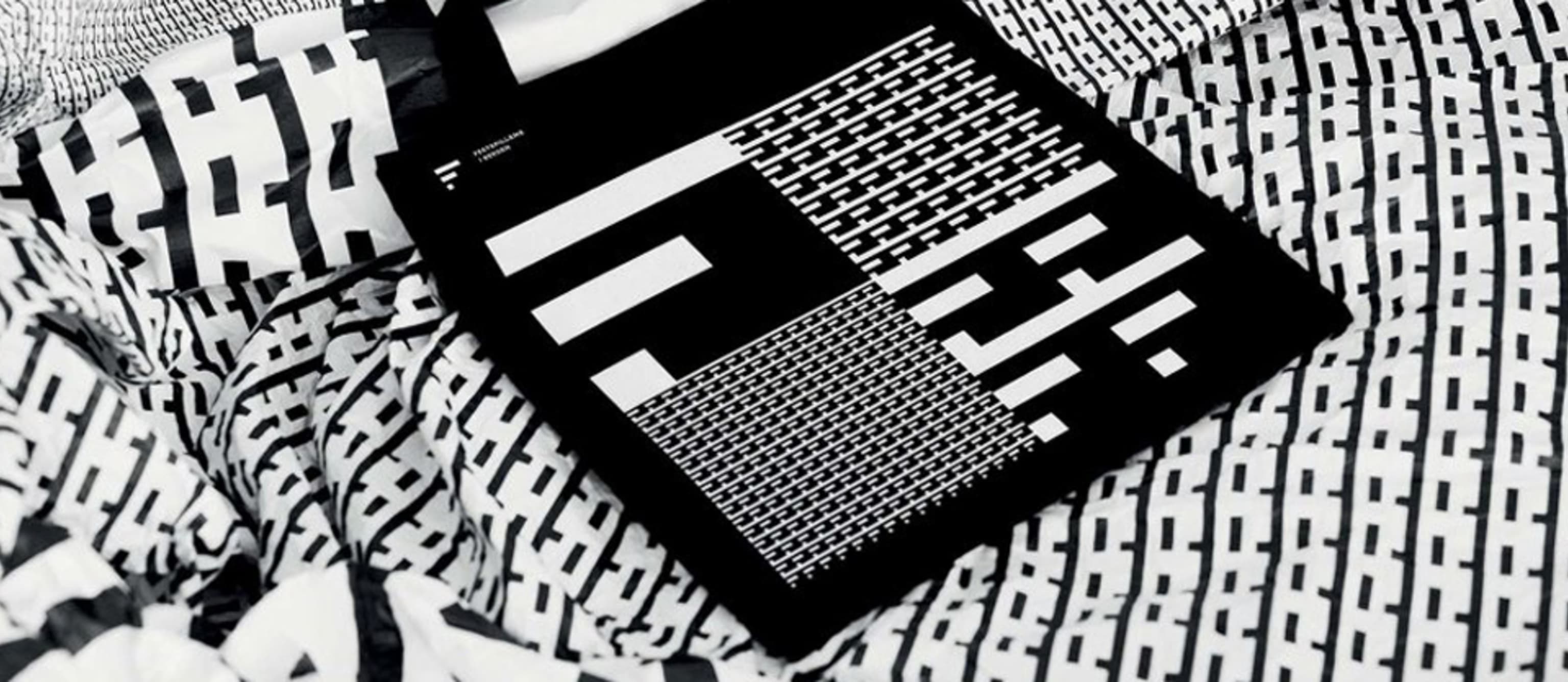
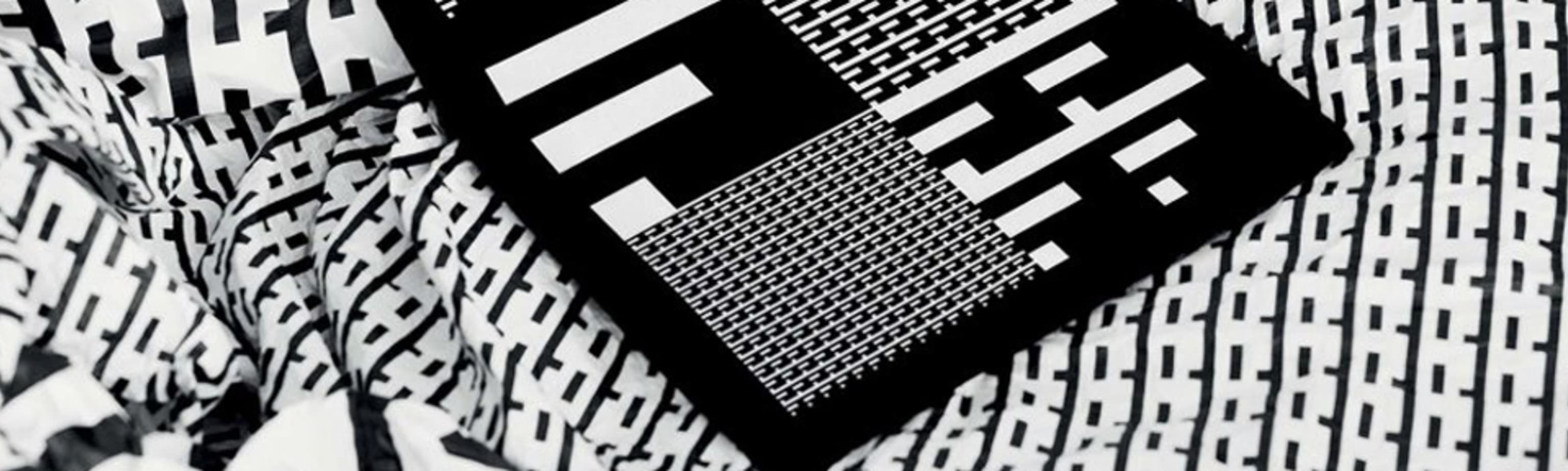
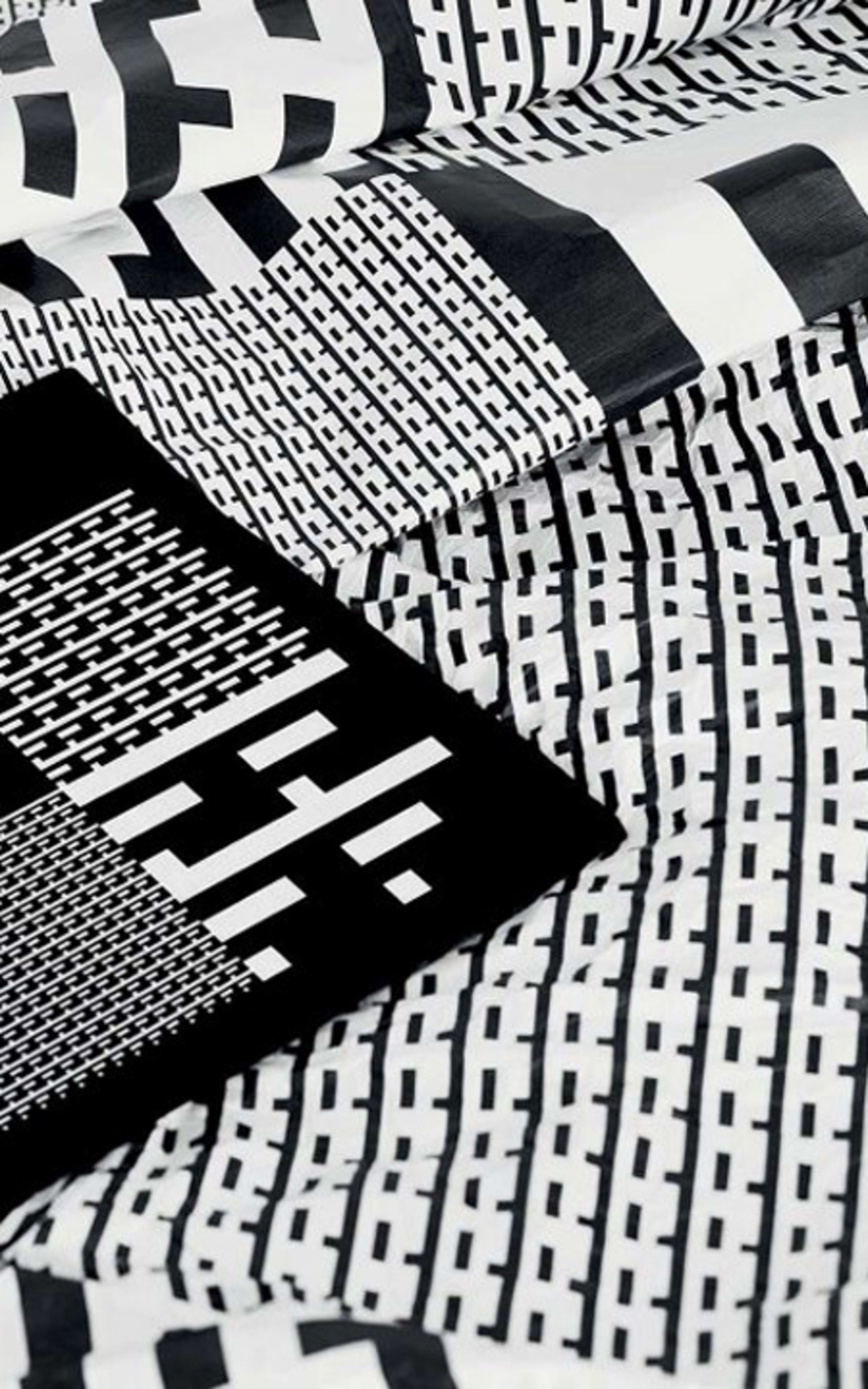
The Festival’s visual design is based upon the structure of music. The individual parts are patterns and colours, built around the stylized logo F. This creates many opportunities for the design, while helping the Festival to present a universal visual identity.
– What may be unique about this design profile is its lack of boundaries between the logo and the supporting elements. The logo is the pattern and the pattern is the logo – and in that way you achieve a higher frequency of use – and a quicker establishment of the logo without becoming loud and obtrusive, says Endre Berentzen, creative director and founding partner of Anti Bergen, to Kampanje.